How to Change Microsoft Outlook's Display To Reduce Eye Strain
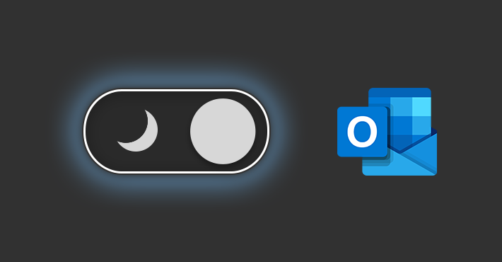 |
| How to Turn On Dark Mode In Microsoft Outlook. Photo codetwo |
Many users prefer to use “Dark Mode” in their Office applications as it reduces the amount of bright white light on screen that can get quite uncomfortable after a while. Luckily, Microsoft Office has themes that can be used to change the color appearance of Office applications like Word and Outlook to be, for example, black. In the past, the black Office theme has kept Word documents white while turning most of the user interface to the darker color. However, it seems that Word has recently started turning the documents of some users black as well.
What is Microsoft Outlook?
Microsoft Outlook was introduced to the public in 1997 and was included with Microsoft Office 97. Outlook Express was included with Windows XP (and was the only free version). Since then, Microsoft has released an abundance of updated versions, each offering more features than the one before it.
Microsoft Outlook is an application that's used mainly to send and receive emails. It's also used to manage various types of personal data including calendar appointments and similar entries, tasks, contacts, and notes. Microsoft Outlook isn't free though; you must purchase it outright or pay a subscription for it if you want to use it.
| What's the difference between Outlook and Gmail? Outlook and Gmail both let you access your messages via POP3 or IMAP. You can set up multiple email providers in Outlook, while Gmail is mainly used with Google's email service. Generally speaking, Gmail is free and offers a more streamlined experience, while Outlook is more feature-rich and requires a subscription. |
READ MORE: Gmail Storage Full: How to Clean Up and Save Some Space
How does dark mode work on Microsoft Outlook?
 |
| Photo codetwo |
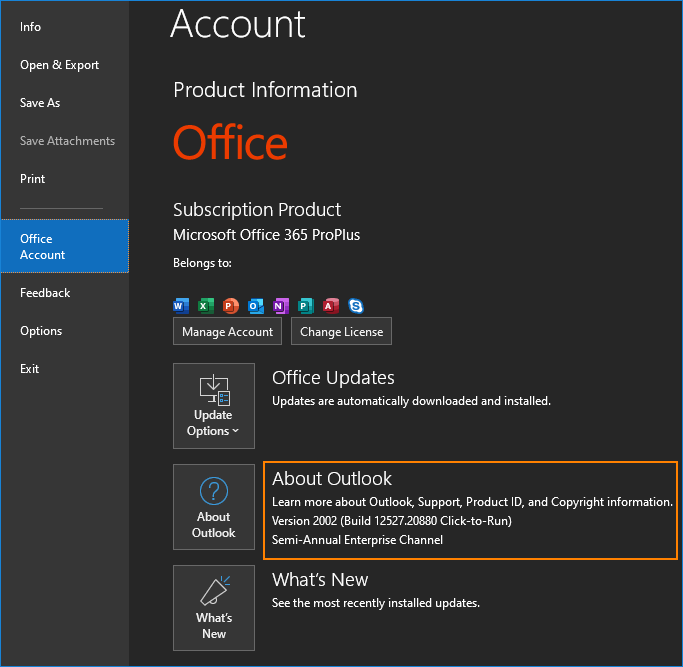
The dark mode, or “switch background” option, is something entirely new for the Office suite. Outlook has already had the so-called black theme available. But the black theme that’s been around for years has in fact a very limited use in Outlook – it only changes the frame around emails, leaving the actual email body unchanged (usually, the background stays white, which strains your eyes a lot). With dark mode, which is an extension of the black theme, you can change the background, too, making Outlook eyesight-friendly.
Those who like dark mode appreciate that the screen emits less light. Dark mode is simply more comfortable for your eyes. For some people, prolonged exposure to overwhelming bright background causes headaches. Not to mention that if you check your Outlook at night, those white backgrounds bear a strong resemblance to blinding headlights. Ask most developers if they would like to work in a light IDE…
The dark mode changes the background of any email type (HTML, RTF, or plain text) to its darker version. The background, of course, is not the only element that changes its color. Fonts, separators – all those elements have their colors changed so that the whole email message gets darker (while not affecting readability).
| The most obvious, traditional color of an email background is white while font is typically black. The night mode will convert such messages into whiteish text on a blackish background. To be exact, white (#FFF) changes into a very dark gray (#262626) and black (#000) changes into a “dirty” white (#F6F6F6). On the other hand, HTML-designed emails (usually newsletters) are sometimes created with the dark background by default – those emails will get brighter in dark mode. |
How to turn on dark mode in Outlook
 |
| Photo Business Insider |
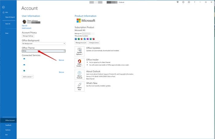
You can turn on dark mode by setting Outlook's color scheme to black:
1. In Outlook, click File in the toolbar. You'll see the Account Information page.
2. In the sidebar on the left, click Office Account.
3. Under Office Theme, click the dropdown menu and choose Black.
4. Click the back button at the top left of the window to return to the inbox.
The Office Account page in the File tab is where you'll find the Office Theme menu for choosing dark mode. Dave Johnson
Quick tip: Outlook can follow whatever color scheme Windows is using. In the Office Theme dropdown menu, choose Use system setting. If you've configured Windows for dark mode, Outlook will do the same.
How to turn on dark mode in Outlook for Android
#1: Run the Microsoft Outlook app on your Android device.
#2: Tap the Hamburger icon (three-lined icon) at the top left corner of the screen.
#3: Then, tap on the Settings icon at the left bottom side.
#4: Next, scroll down and select the Theme option. It will open the prompt with three options, Light, Dark and Set by Battery Saver.
#5: Choose Dark to turn on Outlook dark mode on Android.
#6: To disable the dark mode, click the Light option from the Themes settings.
How to turn on dark mode in Outlook for iPhone
#1: Open the Microsoft Outlook app on your iPhone or iPad.
#2: Make a tap on your Profile icon at the top left corner of the app screen.
#3: Then tap Settings icon from the bottom of the menu.
#4: Finally, tap the toggle to the right of Dark mode to enable it.
#5: Scroll down to Dark Mode under preference section.
#6: If you want to turn off dark mode, click the Dark Mode toggle to turn your app background white.
In some cases, you have to turn on iPhone dark mode to enable the dark theme on certain apps.
How to turn off dark mode in Outlook
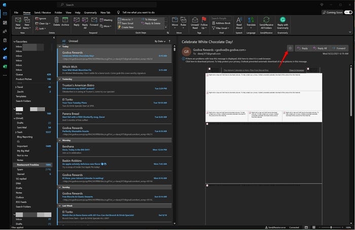
When Outlook is using the dark theme, you can switch dark mode on and off for the current message using the dark mode toggle button. Click the Switch Background button at the top of the message window to the left of the Reply button. The button changes from looking like a lightbulb to a moon depending on whether you've turned dark mode on or off for that message.
 |
| Photo Business Insider |
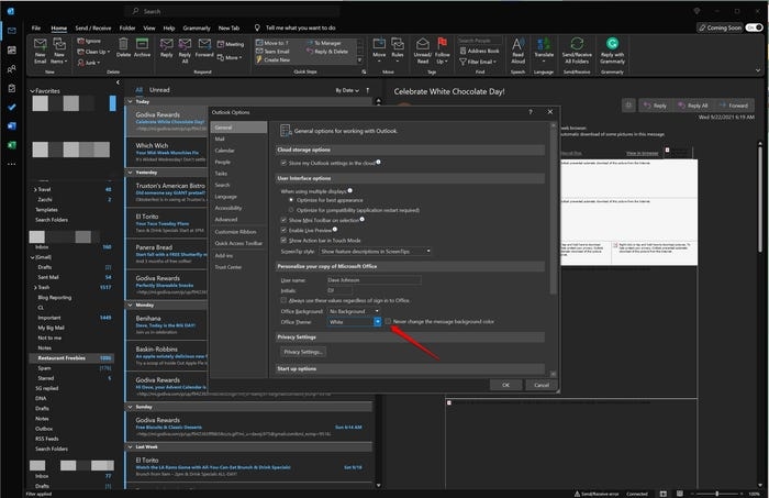
If you prefer, you can disable the dark theme entirely:
1. Click File in the toolbar and then click Options.
2. In the General tab, find Office Themes in the Personalize your copy of Microsoft Office section.
3. Click the dropdown menu and choose White.
4. Click the checkbox to enable Never change the message background color.
 |
| Photo Business Insider |
Perfect email signatures in dark mode
You don’t care about dark mode and don’t want to use it? No problem. Keep in mind, however, that you have no control over your recipients. And since this option changes the background and text color of any message, you might need to take a closer look at your email signature design.
 |
| Photo Signature Email |
Since emails’ text and background are automatically converted (or inverted, if you like), you don’t have to worry about them that much. The case is different, however, if you look at images – they will stay exactly the same as in the “light mode”. Which might ruin them completely, especially if they have a white non-transparent background.
So, how to make your email signatures dark mode friendly? Here are some guidelines:
Do not use all-image email signatures. Using email signatures that are just one huge image is never a good idea. Using them in the dark mode is even worse: recipients will immediately see that those signatures are out of place.
Get rid of white backgrounds. A social icon or logo on a white background is bound to look out of place in dark mode. All graphic elements will probably look better on a transparent background, so they can become a unified part of the design.
Use images that look well in both modes. It is crucial that your email signatures look well in both modes – the dark and the light. While the traditional, white background will most probably continue to prevail, the dark mode is bound to get some popularity. So, when it comes to social icons, badges, or other graphic email signature elements, it’s a good idea to use colors that will stand out regardless of the recipient’s display mode.
Test your signatures in dark mode. The most reliable way of finding out if your email signature design gets along with dark mode is to test it. Make sure that all elements look well, and the font colors don’t stray too far from your original design.
Manage your email signatures. Using email signature management tools is the easiest and the most reliable way to make sure that all users in your organization have well-designed email signatures. You can design and test your layout once and every user will automatically get personalized email signatures.
Watch out for animated gifs. Although animated gifs usually give a nice touch to an email signature, you need to be extra careful if you want them to look perfect in both dark and standard mode. The safest approach with such animations is to use a neutral solid background, like in this example. White backgrounds, like with images, look out of place and transparent backgrounds won’t give you good results because gifs don’t support semi-transparency, which results in unprofessional, pixelated edges of the animated object.
 How To Change Background on Zoom, Google Meet and Microsoft Teams How To Change Background on Zoom, Google Meet and Microsoft Teams The COVID-19 pandemic has resulted in increased usage of video conferencing services such as Zoom, Google Meet and Microsoft Teams to conduct virtual meetings or ... |
 How to Convert Docx to Doc: Simple Ways to Change How to Convert Docx to Doc: Simple Ways to Change You can easily convert your DOCX files to DOC with these simple steps. |
 Who is Bill Gates - The founder of Microsoft Corp? Who is Bill Gates - The founder of Microsoft Corp? Have you ever heard of Bill Gates— the founder of Microsoft Corp, one of the world's richest people, consistently ranking high on Forbes' list of ... |


