Top 10 Weirdest World Maps That Make You Amazed
 |
| Top 10 Weirdest World Maps That Make You Amazed |
Google Earth compiles images from various sources, from satellites in geosynchronous orbit that snap low-resolution photos from tens of thousands of miles above Earth to satellites closer to Earth that capture higher-resolution shots, and even aerial photos taken from airplanes, kites, drones, and even balloons. The imagery is available to anyone who downloads the software, and archaeologists have taken advantage of this rich resource.
The map might not be the territory, but gosh darn it both aren't fascinating to look at! We’re pretty big fans of maps and we can’t wait to set our eyes on even more unusual and peculiar ones in order to expand our minds and feed our imaginations which are hungry for aesthetic designs. Luckily for us, there are tons of like-minded internet users who are nearly bursting with their love of maps.
From a boneyard of military planes to a polka-dot pattern created by ants, to mysterious structures etched into the Gobi Desert and even a phantom island in the South Pacific, Google Earth brings some wacky places to light. Here's a look at some of the weirdest!
Top 10 weirdest world maps that make you amazed
1. Countries Not Using the Metric System
2. The British have invaded almost every country on Earth
3. The world's major writing systems
4. The wealthiest American in every state
5. Europe's Most Popular Last Names
6. The countries where people are the most and least emotional
7. A European missionary's map of Africa, circa 1908
8. Much of America is uninhabited
9. The map of world wealth
10. Antarctica’s weird time zones
*****
1. Countries Not Using the Metric System
 |
| Photo: zmescience |
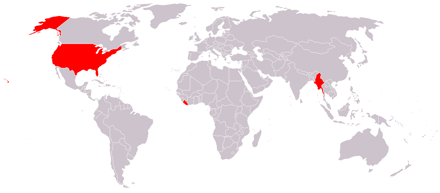
How many countries do not use the metric system other than the United States? Two!
Myanmar (also known as Burma) and Liberia are the only other countries on Earth that have not officially adopted this system of measurement. Perhaps it's time for these countries to join the rest of the world?
Note: Some of these images contain slightly outdated numbers. Do not use these for your next test without doing your research first!
2. The British have invaded almost every country on Earth
 |
| Photo: humanosphere |
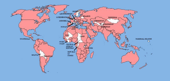
In the book All The Countries We’ve Ever Invaded, British historian Stuart Laycock writes, “Out of 193 countries that are currently UN member states, [the British] invaded or fought conflicts in the territory of 171. That’s not far off a massive, jaw-dropping 90 per cent.” But a lot of those incursions are relatively obscure. For instance, the time British troops took the Ionian islands doesn’t make it into many non-Ionian history books. Laycock’s methodology is broad — he includes British pirates, privateers, and armed explorers whose activities were blessed by the government — and his research goes all the way back to the beginning. In a review, the Telegraph notes, “The earliest invasion launched from these islands was an incursion into Gaul — now France —at the end of the second century. Clodius Albinus led an army, thought to include many Britons, across the Channel in an attempt to seize the imperial throne. The force was defeated in 197 at Lyon.”
3. The world's major writing systems
 |
| Photo: vividmaps |
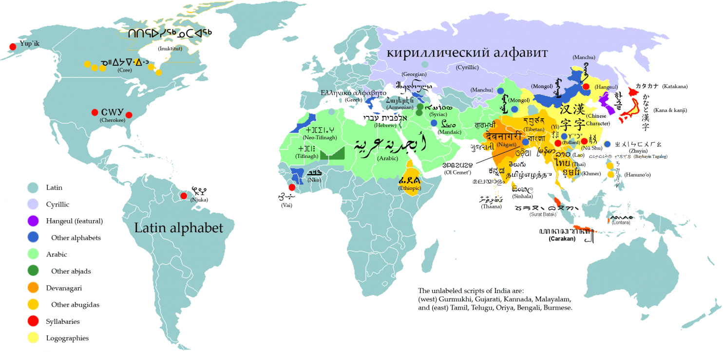
This map is a reminder that the world's divisions and commonalities go much deeper than national borders. It also helps to tell the stories of a few major events that still shape the globe, the echoes of which you can see in almost every map on this page: European colonialism, the Arabic-speaking Islamic conquests of the 7th century, the Russian expansions of the 19th and 20th centuries, and the (still-ongoing!) unifications of India and China.
10+ Weirdest World Maps from the Middle Ages
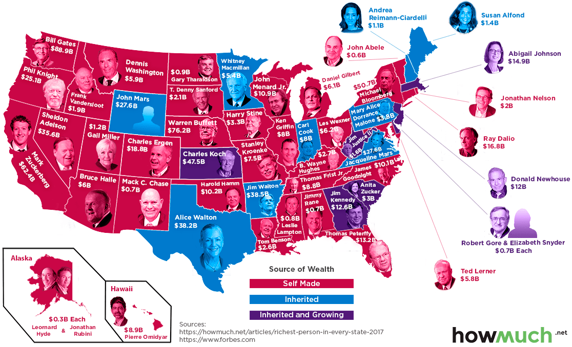
4. The wealthiest American in every state
 |
| Photo: visualcapitalist |
The geography of wealth inequality doesn’t get much attention. But it’s stark. There are about 450 billionaires with American citizenship — and almost 200 of them live in New York and California. The result is this map. In some states, the richest people are well-known names, like Bill Gates or Sheldon Adelson. But how many of you know Leslie Wexler, CEO of the L Brands corporation and, with $5.7 billion, the richest man in Ohio? How about Anne Cox Chambers, who holds a controlling interest in Cox Enterprises and, with an estimated net worth of $15.5 billion, is the richest person in Atlanta?
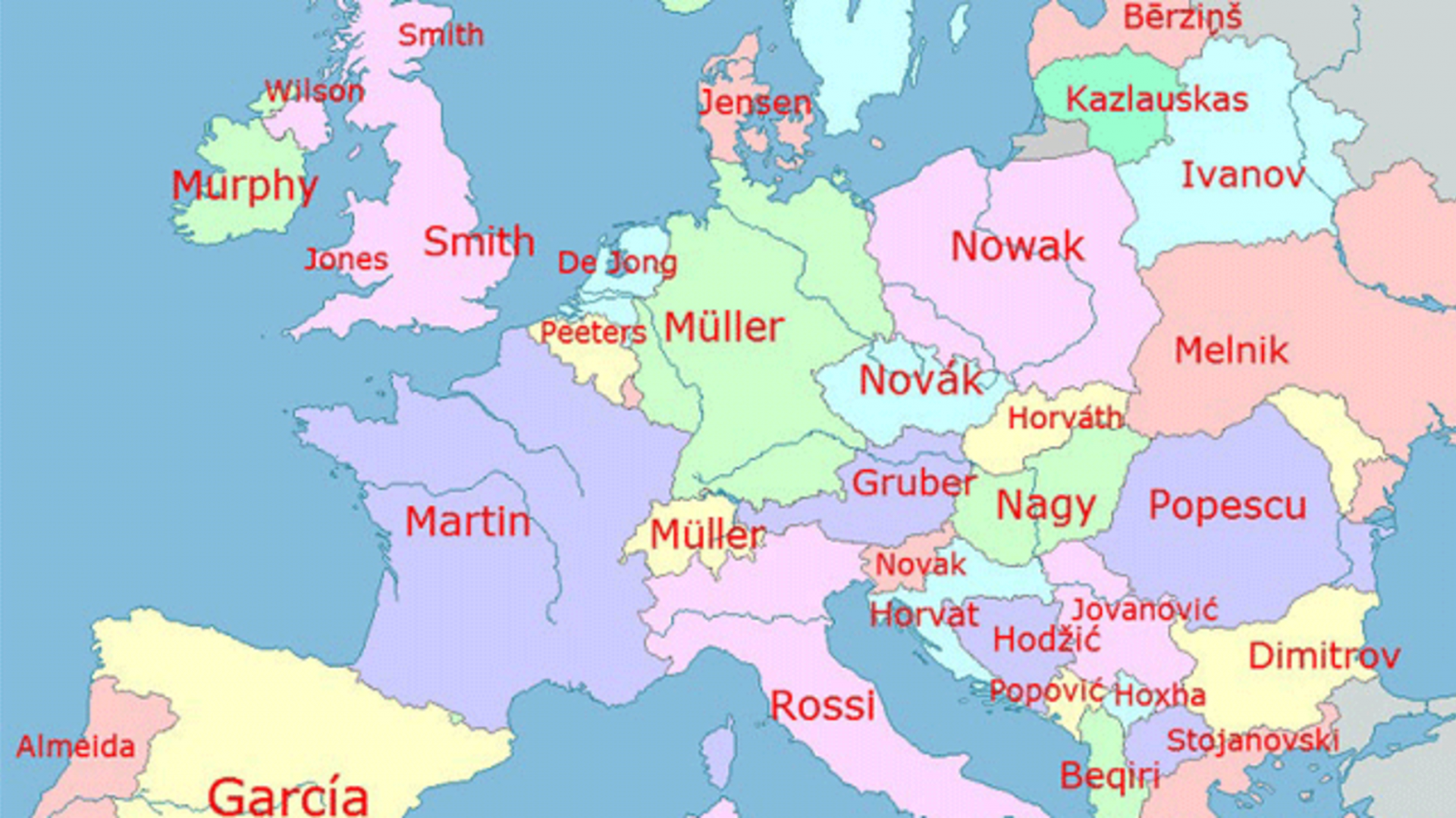
5. Europe's Most Popular Last Names
 |
| Photo: sendbreadquick |
How did the most common last names in Europe come about?
Many surnames stem from a profession. In England, the popular surname Smith is derived from the Old English term meaning "one who works in metal." In Austria, Gruber translates to "miner."
Other names come from a parent's name, such as Ivanov, which translates into "Ivan's" (as in, the child of Ivan), or Dimitrov, which means "son of Dimitar."
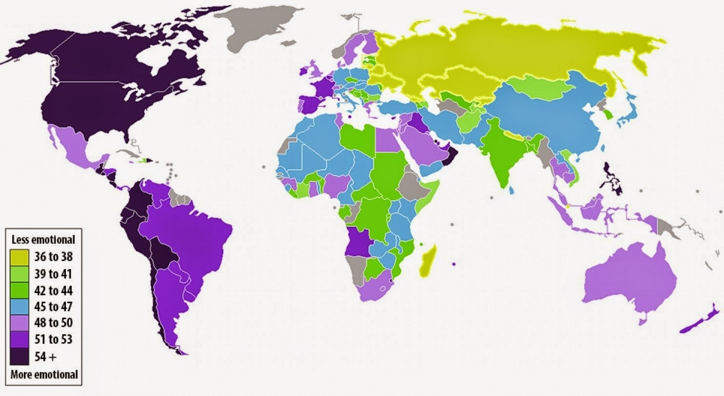
6. The countries where people are the most and least emotional
 |
| Photo: vividmaps |
People in yellow countries are the least likely to report having emotional experiences of any kind, positive or negative. Purple countries are where people report experiencing the most feelings. If you're surprised to see that the United States is among the world's most emotional countries (but far from No. 1) or want to learn why some regions are so unemotional, you can read all about it here.
Since 2009, the Gallup polling firm has surveyed people in 150 countries and territories on, among other things, their daily emotional experiences. Their survey asks five questions, meant to gauge whether the respondent felt significant positive or negative emotions the day prior to the survey. The more times that people answer "yes" to questions such as "Did you smile or laugh a lot yesterday?", the more emotional they're deemed to be.
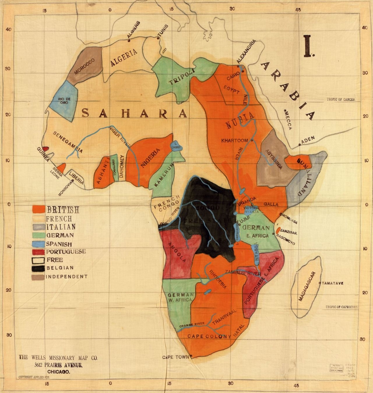
7. A European missionary's map of Africa, circa 1908
 |
| Photo: mapsontheweb |
I have this one hanging over my desk in part because of its appeal as a historic document (the borders are tellingly rough) but also as a reminder of the colonial legacy in Africa, which European powers divided up a century ago with little respect for how actual Africans wanted to be grouped. Those arbitrary borders are still with us today, in part because African leaders agreed not to dispute them when they won independence. The borders contribute significantly to conflict and unrest on the continent because there are so many diverse communities forced together.
8. Much of America is uninhabited
 |
| Photo: theifod |
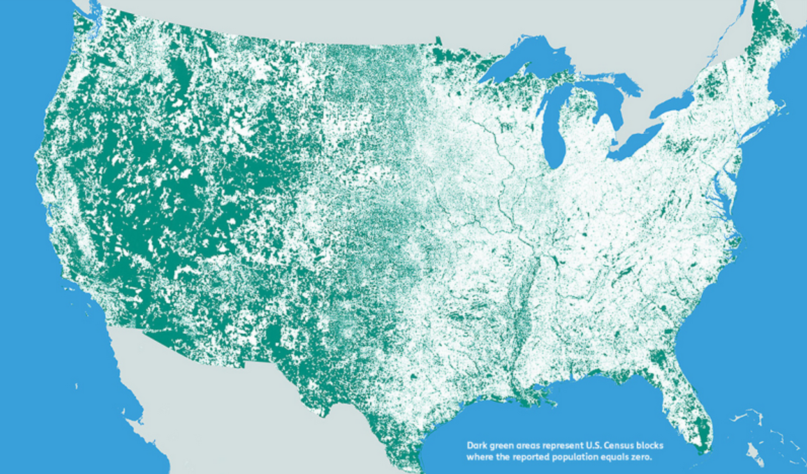
This map, by Nik Freeman, pulls out the 4,871,270 census blocks — covering 4.6 million square kilometers — where no one lives. That tends to mean one of three things: the first is that the land is uninhabitable, perhaps because it’s covered by a lake. The second is that laws or other kinds of sanctions prevent settlement, for instance on national parks. The third is that it’s a commercial or industrial zone where people work but no one actually lives. “Human geographers spend so much time thinking about where people are,” Freeman writes. “I thought I might bring some new insight by showing where they are not.”
9. The map of world wealth
 |
| Photo: viewsoftheworld |
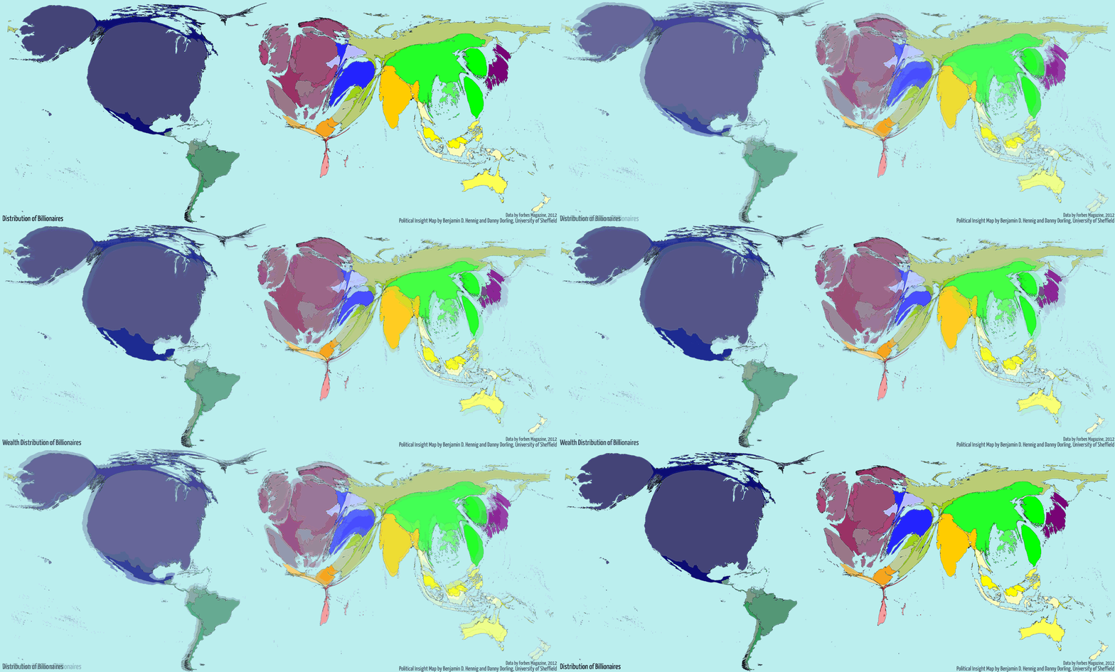
This is a map of the world weighted not by land mass or navigation lines but around how much wealth each country has. As you can see, North America and Western Europe balloon to enormous proportions — even after adjusting for purchasing power, 46 percent of global wealth in 2002 was in their hands. The horror of this map is the shrunken husk of Africa. That’s a lot of people living with very little.
10. Antarctica’s weird time zones
 |
| Photo: wikipedia |
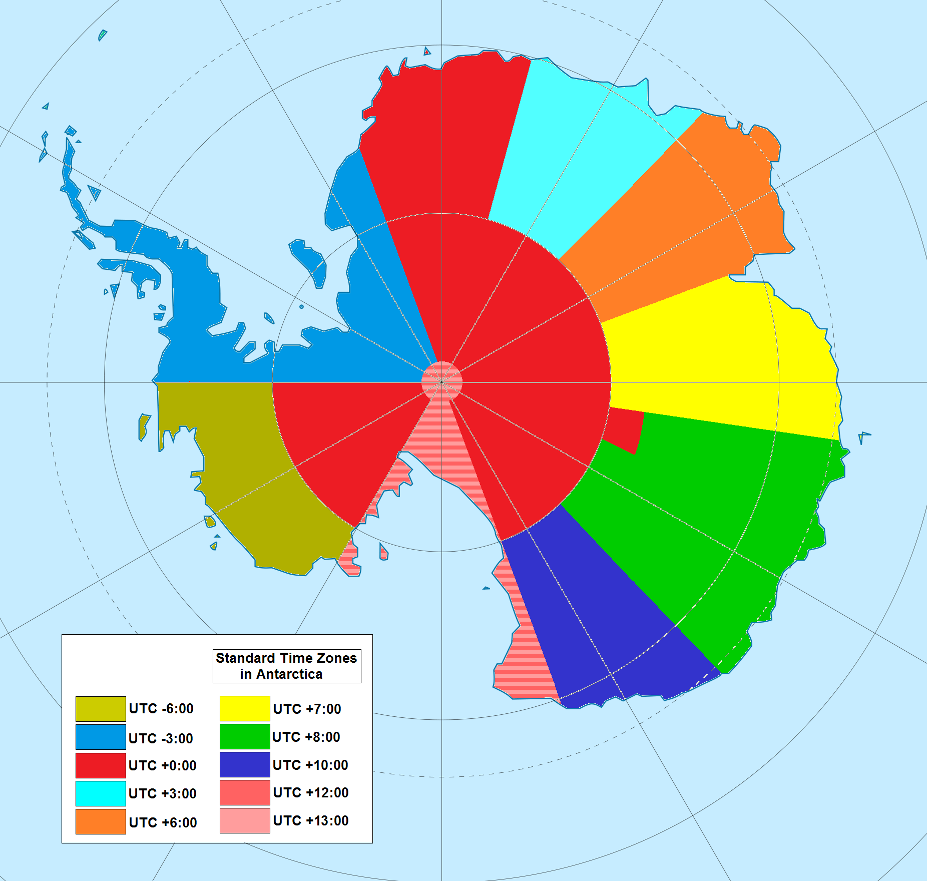
The South Pole is located almost smack in the center of Antarctica. That puts the continent on every line of longitude — and, in theory, in every single timezone. But as an interesting Wikipedia article on the subject explains, the extreme day-night cycles make that impractical, and thus time zones are often based on territorial claims. The result is that “many stations use the time of the country they are owned by or the time zone of their supply base (e.g. McMurdo Station and Amundsen–Scott South Pole Station use New Zealand time due to their main supply base being Christchurch, New Zealand). Nearby stations can have different time zones, because of belonging to different countries.”
 How To Share Location on iPhone - iMessage, Google Maps and Apple Maps How To Share Location on iPhone - iMessage, Google Maps and Apple Maps GPS is one of the most important parts of the iPhone, and its various functions will be greatly needed in many situations. |
 Five Biggest Changes in Google Maps Five Biggest Changes in Google Maps Have you checked the newest changes on Google Maps, which helps to build a complete and perfect traveling route? Check the article given right below ... |
 How to Add or Edit Road on Google Maps? How to Add or Edit Road on Google Maps? So great, you will be able to draw missing roads on Google Maps or edit the wrong ones. Check out how this tool works? |


