10+ Weirdest World Maps from the Middle Ages
 |
| Top 10+ Weirdest World Maps from the Middle Ages |
One of the most remarkable and mysterious technical advances in the history of the world is written on the hide of a 13th-century calf. Inked into the vellum is a chart of the Mediterranean so accurate that ships today could navigate with it. Most earlier maps that included the region were not intended for navigation and were so imprecise that they are virtually unrecognizable to the modern eye.
That first portolan mapmaker also created an enormous puzzle for historians to come, because he left behind few hints of his method: no rough drafts, no sketches, no descriptions of his work. “Even with all the information he had — every sailor’s notebook, every description in every journal — I wouldn’t know how to make the map he made,” says John Hessler, a specialist in modern cartography at the Library of Congress.
Our list of the best medieval maps – ten maps created between the sixth and sixteenth centuries, which offer unique views into how medieval people saw their world. These maps are arranged chronologically, which helps to reveal some of the changes that took place during the Middle Ages in how people created maps.
Top 10+ Weirdest World Maps from the Middle Ages
1. Psalter World Map, Circa 126
2. T-O Map From Isidore Of Seville's 'Etymologies,' Circa 600
3. Anglo-Saxon World Map, Circa 1025-1050Beatus Map, Circa 776
4. Beatus Map, Circa 776
5. Itinerary Map By Matthew Paris, Circa 1250s
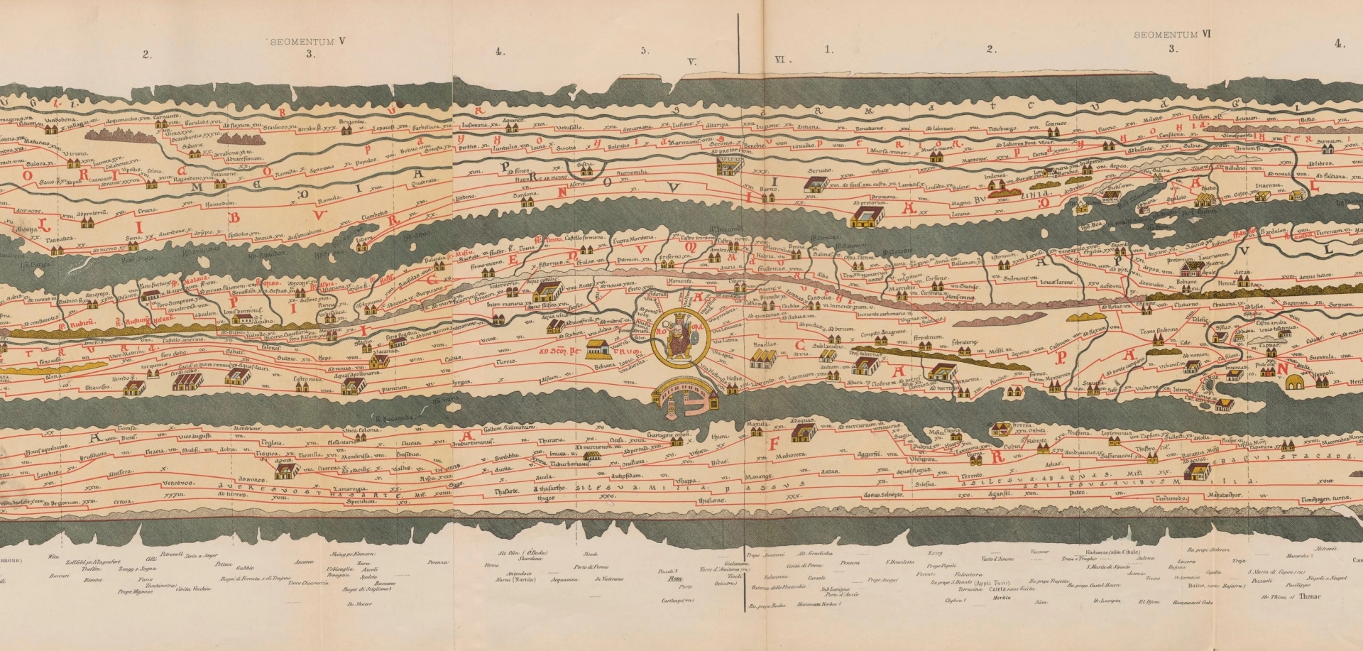
6. Tabula Peutingeriana, 1265
7. Hereford Mappa Mundi, Circa 1300
8. Ebstorf Map, Circa 1234
9. Da Ming Hunyi Tu Map, 1389
10. Tabula Rogeriana, Circa 1154
******
1. Psalter World Map, Circa 126
 |
| Photo: worldhistory |
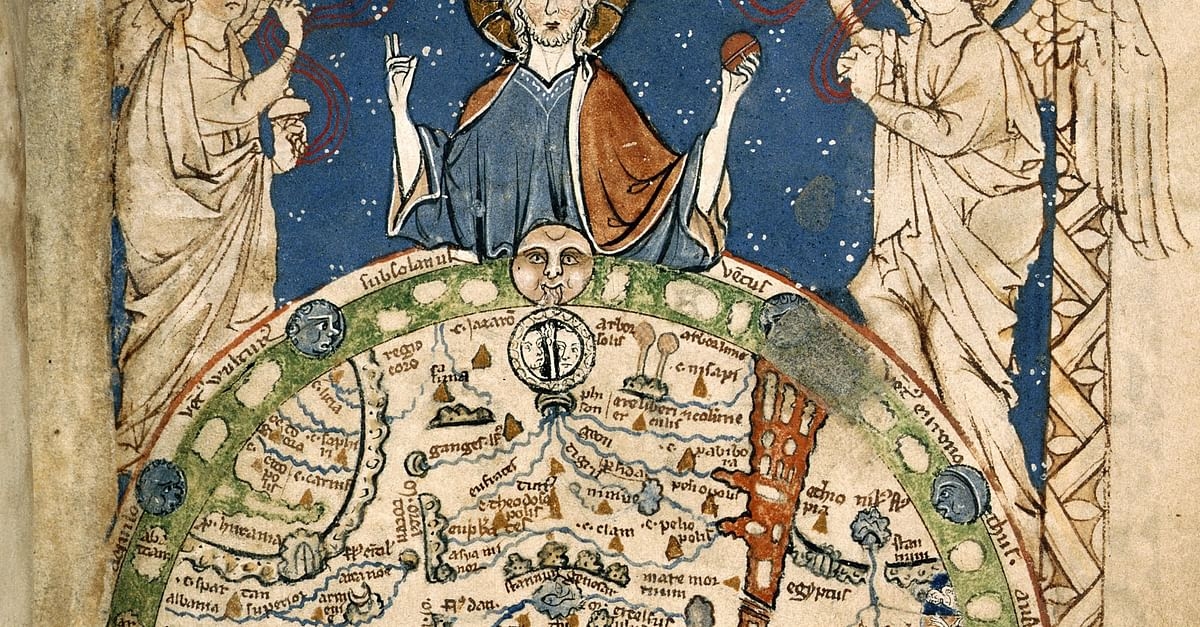
The "Psalter World Map" was made c. 1265, and depicts the world as it was known to Medieval Europeans. Approx. 9.5 cm (3.7 in) high. (Courtesy of the British Library)
The Map Psalter takes its name from its full-page illustration of a map of the world , whose design shares close parallels with the famous mappa mundi, now housed at Hereford Cathedral. The image shows Christ holding the orb of the world, flanked by two angels. The map itself is highly detailed. Jerusalem is marked in the centre, with Rome appearing slightly below it. Major rivers, such as the Ganges and the Danube, are drawn in blue, and the Red Sea is also included. Representations of the so-called ‘Marvels of the East’ line the right-hand side of the painting. The British Isles are found to the lower left. On the reverse of this page, a framed tinted drawing depicts God standing and holding a globe divided into three parts, representing the continents of Asia, Europe, and Africa.
The manuscript was made in London during the latter half of the 13th century but after 1262, as the Psalter’s calendar commemorates on 3rd April the feast day of St Richard of Chichester who was canonised in 1262. Most of the Psalter’s decoration was completed at this stage, including historiated initials (enlarged letters containing images) that mark the major divisions of the text and a unique illustration of the Virgin and Child enthroned), with Mary’s feet resting on a lion.
Late in the 13th century, a different artist added a series of six full-page illustrations depicting scenes from the Life of Christ to the beginning of the manuscript. These images were bound in the wrong order, with Christ’s Resurrection notably appearing before his Crucifixion.
2. T-O Map From Isidore Of Seville's 'Etymologies', Circa 600
 |
| Photo: commons.wikimedia. |
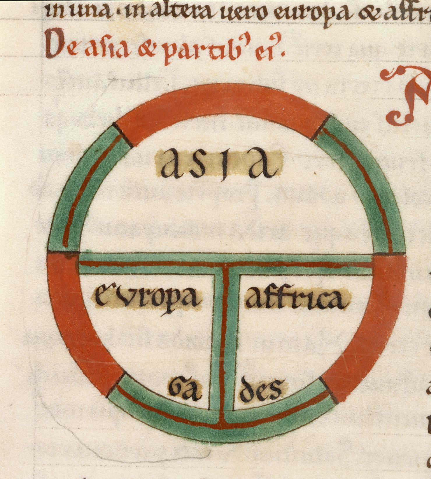
T-O maps depict the world in three zones, the only known landmasses of the time. The map is oriented with east at the top of the map and a circle surrounding the known landforms of Asia, Africa and Europe forming a ‘T’ shape. The waters in between each section represent the Red Sea, the Black Sea, the Don River and the Sea of Azov. Scholars of these maps have come to understand that medieval scholars likely knew the earth was spherical, contradicting the common myth that Columbus was the first navigator to prove the Earth was round.
Asia is shown at the top of the map, with Europe and Africa below. The Mediterranean, the Nile, and the River Don make up the water separating the continents.
This style of map, which didn’t prioritize accuracy, was meant to highlight the harmonious balance between the continents. It was also clearly a religious map: Jerusalem was at the center, and mapmakers often included religiously significant items, such as Noah’s Ark or the Earthly Paradise.
3. Anglo-Saxon World Map, Circa 1025-1050
 |
| Photo: arthurianweb.wordpress |
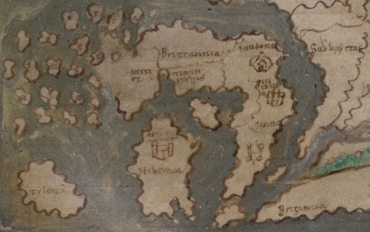
The "Cotton Map" is an Anglo-Saxon map of the world produced during the 12th Century. The map is oriented with East at the top, and West at the bottom, in the style of many Medieval maps. The Anglo-Saxon map is sometimes called the "Cotton Map" after Cotton MS Tiberius B.V., the manuscript in which it is drawn. Drawn in an unusual rectangular format, it was probably based on a model made during the time of the Roman Empire (27 BC–476 AD). The map is also known as the ‘Cotton’ or ‘Tiberius World Map’, named after ‘Cotton MS Tiberius B V’, the shelfmark it was given when it was part of the library of Sir Robert Cotton.
One of the map’s most notable features is its detailed representation of the British Isles, found in the bottom left hand corner, opposite Gaul (modern-day France). Cornwall, the Scilly Isles, the Orkneys, the Channel Islands, and the Isles of Man and Wight are all recognisable, and the irregular and indented coastline of Scotland is particularly accurate. The Cornish Peninsula also features a small drawing of two armed warriors fighting each other, though it is unclear who these figures are meant to represent.
4. Beatus Map, Circa 776
 |
| Photo: wikipedia |
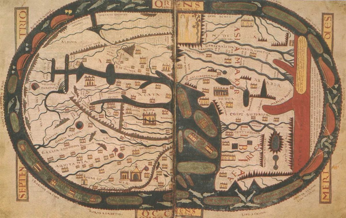
Beatus was a monk who lived on the Iberian peninsula. Drawing on the writings of Isodore of Seville, he produced a map like this one. Although the original has been lost this is believed to be a faithful copy.
Beatus of Liébana was a monk geographer from the Iberian Kingdom of Asturias during the eighth-century. He created this world map around the year 776, basing it on the accounts given by Isidore of Seville, Ptolemy and the Holy Bible.
The original version of this map does not survive, but several copies were made, including the one shown here, which comes from the monastery of St.Sever in France. Some interesting details including placing the Garden of Eden at the end of Asia and locating a fourth continent beyond Africa.
5. Itinerary Map By Matthew Paris, Circa 1250s
 |
| Photo: blogs.bl.uk |
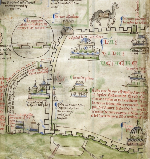
This map of Palestine from the Royal manuscripts collection was created by Matthew Paris in mid-13th-century, and is dominated by its plan of Acre – the large walled enclosure with a camel outside it. Jerusalem, another walled enclosure (top right) is small by comparison, and other coastal cities (centre right) are marked simply by castles and towers. It is not known where Matthew Paris got his information about Acre, which a Latin note on the map as 'the hope and refuge of all Christians in the Holy Land' – it was the last surviving foothold of the crusaders there.
Paris is one of the most engaging of medieval chroniclers. His accounts are detailed and well informed, with lively descriptions of people involved and analysis of the causes and significance of the events recorded. Matthew's connections made him a well-placed observer of contemporary affairs. He was on personal terms both with the king, Henry III, and his influential brother, Richard, Earl of Cornwall. At their courts Paris must have gained many insights into domestic and foreign politics.
His writings reveal a man of strong opinions who was not afraid to speak his mind. Being befriended and publicly honoured by Henry III on several occasions did not prevent him from being as critical of the king's lack of prudence in political matters as he was praising of his piety in religion.
6. Tabula Peutingeriana, 1265
 |
| Photo: worldhistory |
Muhammad al-Idrisi was a North African scholar who worked under the King of Sicily Roger II for many years. al-Idrisi produced this world map for his patron in the middle of the 12th century as part of a book which featured 70 maps of various regions.
Muhammad al-Idrisi spent much of his early life traveling around the known world, going as far as York in England, Hungary and Anatolia. He settled on the island of Sicily and began working for the Norman King Roger II. In 1154 he created for him the Tabula Rogeriana, which offers a description of the world and over 70 maps of various places. The centre-piece of this book is his world map, which depicts Europe, Asia and the northern part of Africa (the southern part of the world is at the top of the map). Al-Idrisi states that it shows “the seven climatic regions, with their respective countries and districts, coasts and lands, gulfs and seas, watercourses and river mouths.”
7. Hereford Mappa Mundi, Circa 1300
 |
| Photo: historic-uk |
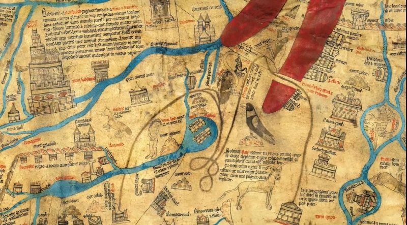
The English Hereford Mappamundi, c. 1300 CE, is the largest surviving world map from the middle ages - 64 by 52 inches. The "Garden Of Eden" was still believed to be a real place, located somewhere in India.
Situated in Hereford Cathedral this world map draws on the tradition of the T and O map although it expands on details in the way later maps would. The legacy of the T and O maps is especially clear in the central position of the Mediterranean sea which still occupies a central position dividing up the land.
In his book On the Map: A Mind-Expanding Exploration of the Way the World Looks, Simon Garfield gives his own own vivid description of the Hereford Mappa Mundi: “The map is frantic – alive with activity and achievement. Once you grow accustomed to it, it is hard to pull yourself away. There are approximately eleven hundred place-names, figurative drawings and inscriptions, sourced from biblical, classical and Christian texts…In its distillation of geographical, historical and religious knowledge the mappa serves as a itinerary, a gazatteer, a parable, a bestiary and an educational aid. Indeed, all history is here, happening at the same time: the Tower of Babel; Noah’s Ark as it comes to rest on dry land; the Golden Fleece; the Labyrinth in Crte where the Minotaur loved. And surely for contemporaries – locals and pilgrims – it must have constituted the most arresting freak show in town. With its parade of dung-firing animals, dog-headed or bat-eared humans, a winged sphinx with a young woman’s face, it seems closer to Hieronymus Bosch than to the scientific Greek cartographers.”
8. Ebstorf Map, Circa 1234
 |
| Photo: researchgate |
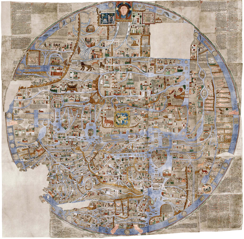
The Ebstorf Map from the 13th century is the largest medieval map known . Although the original was lost during WW2 it is well documented by photos, lithographs and facsimiles. In 1951 -1953 three reproductions were created, one of which may be seen at the convent at Ebstorf, where the map was discovered in 1830.
The Ebstorf Map is an example of a mappa mundi (a Medieval European map of the world) similar to the Hereford Map, believed to be made by Gervase of Tilbury around 1234. It is a tripartite or T and O map centered on Jerusalem with east on top of the map. The original was destroyed during World War II.
The Ebstorf Map (ca 1234) is the largest known mappa mundi – a European medieval map. Less a navigational tool, it is full of religious and ethnographic information, measures 12ft and is illustrated on 30 goatskins. Scholars disagree as to who the author of the map really is. Originally thought to have been created by Gervase of Ebstorf, many others now think it contains too many dissimilar traits and was actually co-created by the nuns of Ebstorf famed for their craft(wo)manship in the Arts.
9. Da Ming Hunyi Tu Map, 1389
 |
| Photo: asiangeo |
One of the earliest surviving world maps from the Far East, China’s Da Ming Hun Yi Tu, or “Amalgamated Map of the Ming Empire,” was drawn on silk as early as 1389. The map spans the entire Eurasian continent from Japan to the Atlantic Ocean, and includes detailed markings of mountain ranges, rivers and administrative centers. It is particularly notable for the way in which it distorts the size of various landmasses. Mainland China sits like a monolith in the middle of the map, while Japan and Korea are both far larger than India. The African continent, meanwhile, is depicted as a relatively small peninsula with what appears to be a giant lake in its center. Despite these peculiarities, the Da Ming Hun Yi Tu is often cited as the first map to show Africa with a southern tip that could be circumnavigated.
10. Tabula Rogeriana, Circa 1154
 |
| Photo: sothebys |
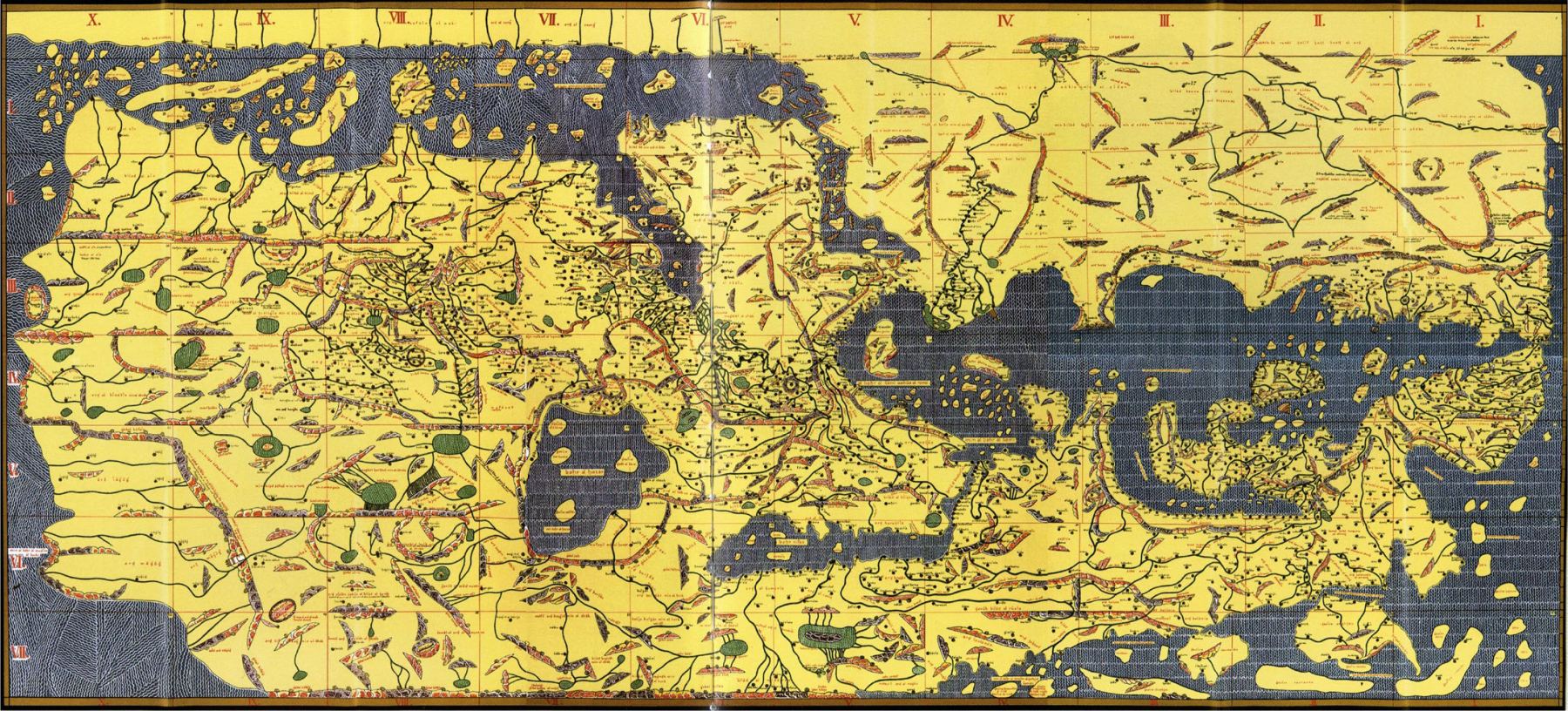
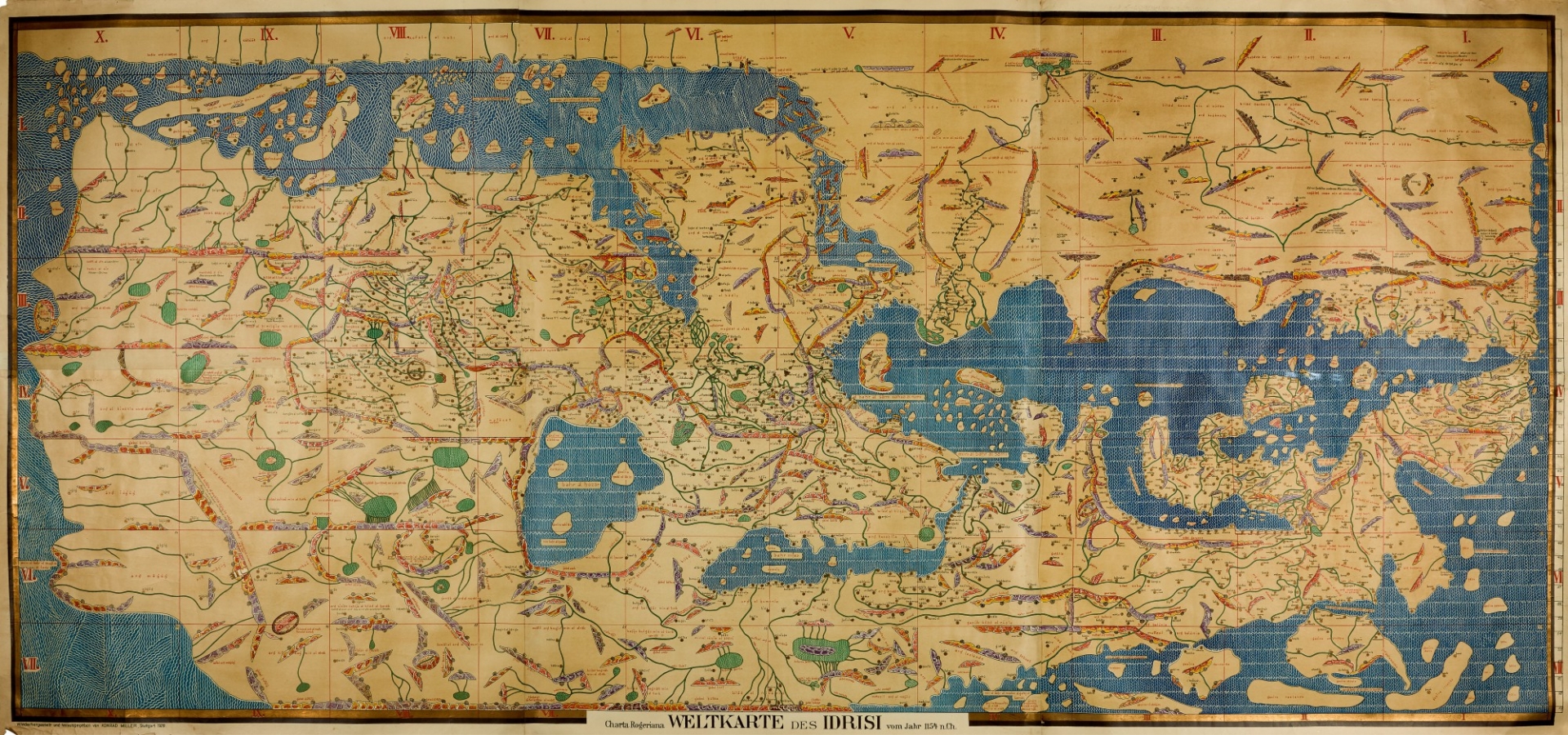
In the 12th century A.D., the renowned Muslim scholar al-Idrisi was invited to the court of the Norman King Roger II and asked to produce a book on geography. The result was the “Tabula Rogeriania,” also known by its longer title, “A Guide to Pleasant Journeys into Faraway Lands.” The book featured several regional maps as well as a projection of the known world, which depicted the entirety of Eurasia and a large section of Africa. By drawing from interviews with travelers and his own wanderings through Europe, al-Idrisi also compiled extensive data on the climate, politics and culture of different regions. The Tabula Rogeriana remained among the world’s most accurate maps for several centuries, but it may appear strange at first glance—in the tradition of Islamic cartographers, al-Idrisi drew it with south positioned at the top.
The Mystery of Extraordinarily Accurate Medieval MapsOne of the most remarkable and mysterious technical advances in the history of the world is written on the hide of a 13th-century calf. Inked into the vellum is a chart of the Mediterranean so accurate that ships today could navigate with it. Most earlier maps that included the region were not intended for navigation and were so imprecise that they are virtually unrecognizable to the modern eye. With this map, it’s as if some medieval mapmaker flew to the heavens and sketched what he saw — though in reality, he could never have traveled higher than a church tower. The person who made this document — the first so-called portolan chart, from the Italian word portolano, meaning “a collection of sailing directions” — spawned a new era of mapmaking and oceanic exploration. For the first time, Europeans could accurately visualize their continent in a way that enabled them to improvise new navigational routes instead of simply going from point to point. That first portolan mapmaker also created an enormous puzzle for historians to come, because he left behind few hints of his method: no rough drafts, no sketches, no descriptions of his work. “Even with all the information he had — every sailor’s notebook, every description in every journal — I wouldn’t know how to make the map he made,” says John Hessler, a specialist in modern cartography at the Library of Congress. But Hessler has approached the question using a tool that is foreign to most historians: mathematics. By systematically analyzing the discrepancies between the portolan charts and modern ones, Hessler has begun to trace the mapmaker’s tracks within the maps themselves. |
 30 Weirdest and Sexiest Swimwear Outfits in The World That You Should Know 30 Weirdest and Sexiest Swimwear Outfits in The World That You Should Know Spring break is coming and here are the weirdest and sexiest perfect swimsuits that you'll never want to take off! |
 Most Weirdest Insurance Policies Around The World Most Weirdest Insurance Policies Around The World What are the weirdest insurance policies in the world? Insurance is available even after the escape of aliens, vampire and bride run away in marriage, ... |
 Top 10 Weirdest Tiny Towns On Earth That You May Not Have Heard Top 10 Weirdest Tiny Towns On Earth That You May Not Have Heard Some places are more wonderfully weird than others — there are even towns that hold Guinness world records for their bizarre traits! |


