A Brief History of Typography
 |
| Typography comes from the Ancient Greek words for ‘impression’ |
But if the words are the same, why does the way they look change people’s perception of what’s been written? That’s because throughout history, typography has done more than just share information.
It’s helped show it, present it to the audience in the most effective way possible. From representing different national identities, political, and cultural movements to mega popular trends, the history of typography is more than a story about technology. It’s about the power of design to communicate.
Early History
Undoubtedly, you know a lot about most used typefaces and know where to look for the best free modern fonts for your visual branding or marketing campaigns. But how much do you actually know about typography history and your favorite fonts’ origins?
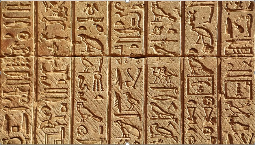
Typography comes from the Ancient Greek words for ‘impression’ and ‘writing,’ meaning that cuneiforms were one of the earliest systems of writing invented. Therefore, cuneiforms can be rightly considered an example of typography, just like the ceramic movable type invented in China during the 11th century. But when most of us imagine typography, we picture one outstanding man – Johannes Gutenberg.
 |
| History of Typography |
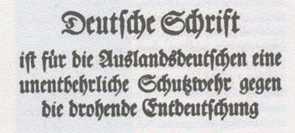
In 1440, Gutenberg introduced Europe to the printing press and movable type, launching print and typography as we think of it today. His first printed books used Fraktur, a type of black letter modeled after a style of letters used by scribes across Europe. With thick vertical lines and thin diagonal connecting, it was easy to consistently reproduce by hand, which made its popularity a question of practicality. Carried into print, that practical need for rigid fractured lines disappeared over time. But Fractur became more than a typeface. It was a design convention that people expected writing to look like.
With the rediscovery of Latin texts that used a calligraphy style developed during the reign of the Holy Roman Emperor, Charlemagne, and also influenced by inscriptions on monuments like Trajan’s column in Rome, Renaissance scholars began developing Roman-style type inspired by classical forms, which used straight lines and regular curves. Today, most major typefaces from Garamond to Times New Roman are derived from this style. Just like Fraktur had spread across Europe, Roman took the writing world by storm. But while its readability made it popular, its origins made it polarizing.
The Rise and Development of Fonts in Europe
Before German unification in the 19th century, language rather than nationality represented Germanic identity. And writing in Fraktur was one of them.
Protestant Martin Luther saw Roman type as an extension of the Catholic Church, and later, Otto von Bismarck would refuse to read German texts that weren’t in German type. When Roman was used, it was in a mixed type style applied to non-German names or places as symbols of otherness. And that trend continued into the 20th century with Fractur featuring heavily in Nazi propaganda.
The meaning of other types would also shift over the centuries. Italics, which we now use to add emphasis, were first invented to mimic handwriting as well as fit more letters on a page, thus saving printing costs. Wingdings, which we now associate with cryptic, random, and often not particularly useful iconography, are a typeface based on dingbats, metal pieces of type used to mimic the decorative embellishments of manuscripts.
Many of the fonts we take for granted today weren’t just popularized by the printing press. English type-founder William Caslon’s work was spread throughout the British Empire and can be found in most printings made by the American founding father Benjamin Franklin. This all reflected how type, as much as language, was another colonial export.
At the end of the 18th century, the Industrial Revolution brought the invention of the paper-making machine and steam-powered printing press. Society was shifting, cities were booming, and advertisers were clamoring to attract the attention and money of the masses. Colorful and creative fonts in newspapers, billboards, and advertisements transformed typography into the powerful marketing tool it continues to be today.
 |
| Rise and Development of Fonts in Europe |
In the early 19th century, the first San Serif flattened typefaces debuted, shaving off the Serifs to create a more commercially useful font that worked well in large sizes. Serifs and San Serifs now represent two primary categories in typography, and the meanings we associate with them has as much to do with their history as with their look. Serifs, those little feet along the edges of a letter, were copied from Roman inscriptions that first inspired renaissance scholars, a stylish tradition that existed for millennia. So in contrast, the more recently invented Sans Serifs with their clean edges and even strokes evoke simplicity and modernity.
 |
| Rise and Development of Fonts in Europe |
Fonts and Trends
Beyond societal shifts, typography also reflected trends. Thus, during the Egyptomania craze of the 19th century, the first Egyptian Slab Serif was given that name not because of its design but as a clever marketing ploy. Later movements, like Bauhaus among others, would also reflect their aesthetics through new forms of typography.
Like all trends, the pendulum eventually swung back, rejecting the wild typefaces of the 19th century in favor of simple shapes. During that time, in 1957, Helvetica, a modern-looking San Serif and one of the world’s more popular fonts was born. Nostalgia and experimentation filled advertisements, posters, and signage of the 20th century with different styles of typography, cementing the associations that certain fonts carry in popular culture.
 |
| Next evolution in typography |
The next evolution in typography came in the 1960s with the advent of digital type and early bitmap fonts built with bulky pixels. As tech advanced, so did type, with designers taking inspiration from the past while also adapting to the new needs of digital platforms.
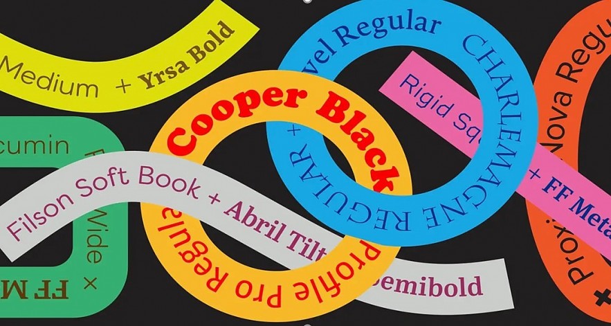
Today, making a new typeface is easier than ever. Fonts are viewed as critical design and branding elements that companies consider right alongside their logos and corporate colors, and for good reason. After all, throughout its history, type has been used to communicate more than just the words it spells out. Suffice it to recall Roman, one of the most common types used today, which was pulled from ancient engravings, re-imagined in Renaissance, turned into a tool to civilize the colonies, and has been stretched, distorted, and used in countless formats only to end up as our computer’s default font.
 Top 30 Best Original Series on Netflix During a Decate Top 30 Best Original Series on Netflix During a Decate Find out the list of the Top 30 best Netflix original series of all time, that you must watch right now. |
 National Read Across America Day: History, Celebration National Read Across America Day: History, Celebration Every year at National Read Across America Day, children across the country kick-off National Reading Month by celebrating the birthday of the beloved Dr. Seuss. |


